Introduction
Fueled by increasingly capable and affordable devices, as well as faster networks; mobile usage is expanding rapidly. Global mobile data traffic reached 2.5 exabytes per month at the end of 2014 and the average mobile network downstream speed in 2014 was 1,683 kbps. In addition, global mobile devices and connections in 2014 grew to 7.4 billion, up from 6.9 billion in 2013 (CISCO, 2014). Building mobile friendly websites represents now both a need and an opportunity to businesses.
Numerous technologies, approaches and strategies are available for web development and web design. The focus of this paper is identifying major strategies for web design, and analyzing their benefits, limitations, and application in the context of mobile web sites.
Background
Many strategies have been proposed to approach to web design. Although the literature covers an ample variety of strategies, this review will focus on three major approaches that emerge repeatedly throughout the literature. These approaches are: responsive web design, adaptive web design, and separate site. Although the literature represents these approaches in a variety of contexts, this paper will primarily focus on their application to mobile websites.
Most early approaches to web design were concerned with building usable interfaces that guarantee continuity between platforms with very different capabilities. Florins and Vanderdonckt (2004) argue that the design must focus on one primary interface designed for the less constrained platform and apply successive transformations to this interface in order to produce interfaces for more constrained platforms. Wong, Chu, and Katagiri (2002) suggest that a single device-independent presentation model eliminates the need of developing and maintaining separate device-specific versions of the same website. Similarly, Artail and Raydan (2005); and Chen, Xie, Ma, and Zhang (2005) promote a re-authoring approach, which consists on diminishing the presentation to provide a minimal experience to handheld devices. Current thinking does not discount early approaches, but builds on them to provide users with access regardless of technological restrictions.
Following the boom of mobile phones with browser support, the creation of websites specifically optimized for mobile became a mainstream strategy. Robbins (2012) argues that a separate strategy is beneficial for mobile sites because its ability of customization. However, Champeon (2003) challenged this notion by claiming that instead of designing for a target platform, the approach should be building a site in successive stages by adding richer content to the basic version of a webpage.
Most current strategies to approach multi-device design focus on achieving a single web experience which smoothly adapts to different device capabilities, screen sizes, screen resolutions, and browsers. Marcotte (2010) argued that rather than constructing separate device-specific experiences, designers could take advantage of standard-base technologies to make the design adaptive to the media that render it. This is supported by Gardner (2011) who claims that adapting layout and content to different viewing contexts across dissimilar devices can enhance user experience.
It can be argued that the use of content adaptation techniques to improve user experience is central to the needs of current mobile web design. In fact, the need of making the same information and services available to user without regard of the device, is a major concern in the idea of One Web put forward by the World Wide Web Consortium (2008). These strategies, with their focus on designing sites that are able to respond to any device, demonstrate that content adaptation has become an essential component of mobile web design.
Discussion of findings
This section discusses the findings of the research and provides a comparative analysis of the approaches under study.
Approaches to web design
In order to understand the origin of the analyzed strategies, it is necessary to discuss two influential approaches to web design: graceful degradation, and progressive enhancement.
Graceful degradation
In the early stages of web development, designers adopted graceful degradation as best practice for delivering the best experience to users with the most up to date browsers. On the other hand, users with older browsers received a degraded version of the website with a minimal level of functionality.
Graceful degradation relies on the principle of fault tolerance, which is the ability of a system to continue to work even on the eventuality of unexpected errors (Gustafson, 2013). Fault tolerance is at the core of two of the fundamental web languages: HTML, and CSS. The specifications of these two languages make possible that browsers display sites with deprecated or unsupported markup. When browsers find tags they cannot interpret, the applications do not crash. Instead, browsers ignore that bit of code, and render the remaining markup. One example of graceful degradation is the “alt” attribute of images whose purpose is display an alternate text to the image. Users whose browser cannot render the image will see the alternate text (Garrett, 2013).
The rationale of graceful degradation is that as HTML and CSS are fault-tolerant, users with old browsers would have at least a minimum of the intended experience. Therefore, it is not worth spending resources making sure that older browsers obtain an equivalent experience to the experience designed for the targeted browsers. Although this assumption makes sense, in practice the development tends to focus only on the most updated browsers, those with the biggest market share. Web developers do not code sites that actually degrade gracefully, but rather ask users to upgrade their browser. Furthermore, graceful degradation overlooks the fact that other programming languages such as JavaScript are not fault tolerant.
Even though graceful degradation provides a limited solution to multi-device design, it could be useful in a few scenarios:
Backward compatibility projects where lack of resources limits the development. For instance, the retrofit of an old website that counts with scarce time or budget.
Very high traffic websites where performance is extremely critical. For example, an edge case where every millisecond of load represents millions of dollars.
The requirements of the product make it so dependent on scripting that maintaining a “basic” version is more viable than enhancing one.
Progressive enhancement
Champeon (2003) first introduced the term progressive enhancement. This approach shares with graceful degradation the concern for making a website work across a variety of browsers and devices. Gustafson (2008) argues that the difference between these approaches lies in where they place the focus, and how this affects the development workflow. Whereas, graceful degradation privileges presentation and functionality over content, progressive enhancement focuses on content. As per the development workflow, different to graceful degradation, progressive enhancement starts with a basic version to ensure that it works in all browsers. After that, web designers can successively add functionalities to enhance the experience on most advanced browsers.
Progressive enhancement is the natural result of the need of providing content regardless the browser that renders it. The diverse multitude of browsers makes difficult for designers to cope with an increasing number of levels of support for web standards and browser capabilities. The idea of change the direction of the development workflow makes that designers do not concern about browser capabilities but focus on content. Moreover, the fact that progressive enhancement goes from a basic to complex, makes it capable of work for any new browser and device that supports web standards.
Progressive enhancement approach separates content, presentation and behavior. The design of a site following this approach consists in building three layers.
Content: This layer includes the HTML markup, which represents the basic version of the site and it must be properly marked up in order to be usable in all versions of browsers and devices.
Presentation: This layer provides the visual appearance with externally linked CSS. By taking advantage of the way that browsers parse style sheet rules, it is possible to create different levels of experience. From the baseline style, that must be designed first, the designer may enhance the presentation for advanced browser.
Behavior: The final layer corresponds to the scripting which makes possible the interaction and functionality. The design must assure that basic functionality, such us linking, works well even when JavaScript is not available.
Progressive enhancement represents an evolution of traditional approaches to web design. Wells and Draganova (2007) claim that this strategy brings a number of benefits, such as improved semantics, accessibility, performance, and search engine optimization (SEO), reduced costs of maintenance and facilitates the inclusion of advanced features. Similarly, Garrett (2013) states that progressive enhancement provides a rich user experience on top an accessible baseline without compromising that baseline. It can be argued that progressive enhancement provides a most suitable approach to the needs of modern web design because it focuses on content, it is future-friendly, and it is medium independent.
Responsive web design (RWD)
Layout is one of the first elements that designers take into account when designing for the web. Before the explosion of tablets and mobile phones, fixed width design was the preferred approach. Fixed width design allows designers to control several graphic elements among others layout, and typography. However, the disadvantage of fixed width design is that its usability depends largely on the screen size. For instance, a fixed-width layout displays a large amount of white space in larger screens, and requires a horizontal scroll bar for smaller screens. An alternate approach to fixed width design is fluid design (also known as liquid design). With fluid design, the elements of the layout share a percentage of the width, which permits them to adjust to the screen resolution. There has been considerable disagreement among web designers over which approach is the best (Weiss, 2006). Whereas proponents of fluid design remark the enhancement of the user experience, those in favor of fixed width design argue that it provides greater control over the design.
Although both fixed-width design and liquid design provide flexibility to web design, their usefulness on the mobile context is limited. As noted by Marcotte (2010), when a flexible design is rendered at viewport smaller than 800x600, the usability of the design degrades considerably. Text navigation can wrap unseemly, images crop, or become too small to be legible. The limitations of fluid and fixed-width design make evident that in providing usability to mobile users, adapting the layout is not an effective choice. Marcotte proposed a solution to this problem, and coined the term Responsive Web Design.
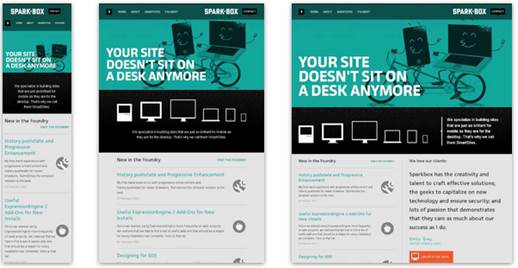
Responsive web design (RWD) is an approach to provide custom layouts across multiple devices. RWD delivers a single HTML document to any device, but applies different style sheets according with the screen size in order to optimize the layout for the given device. Designing with RWD produces a website that not only is resolution and device independent, but also adapts on the base of the features of the device that renders it. For instance, when a responsive site is viewed in a desktop browser, it may show a three-column layout and generic navigation elements such as vertical and horizontal menu bars. The same responsive site will rearrange the content in a single column with augmented links to facilitate tapping, if it is displayed on a smartphone. Some examples of responsive websites are shown in Figure 1.
The technical components of RWD are: Fluid grids, flexible images, and media queries. Fluid grids assign relative units (percentages or ems) to page elements instead of absolute units like pixels or points. Flexible images are also sized in relative units to prevent displaying out of their container. Media queries make possible to switch between different style sheets based on the features of the device in which the webpage is rendered, mainly the width of the screen.
RWD is closely related to the concepts of graceful degradation and progressive enhancement. Mobile-first responsive web design is a mainstream strategy, considered as best practice by the industry, which combines the concept of progressive enhancement with the RWD approach. The strategy consists on starting with an optimized baseline for mobile and enhancing progressively as the layout widens. The opposite side of Mobile-first is responsive retrofitting. In this strategy, the design starts with the desktop version and adds max-width media queries to obtain the mobile version. This approach lines up with graceful degradation.
RWD presents a convenient approach to multi-device design, but it does not provide a solution to other problems on mobile web design. Rudger (2014), Podjarny (2013), Mohorovicic (2013), and ActiveMobi (2014) report that in terms of performance, RWD scores lower than expected. Similarly, Robbins (2012) argues that RWD is good in adjusting the visual appearance, but in order to provide the best experience it requires optimization. Kim (2013) states that responsive websites are likely to take longer to load than their separate mobile sites. Although, RWD offers several benefits it is still far from become an optimal solution for mobile web design mainly because its low performance. Adaptive web design (AWD)
Gustafson (2013) first introduced the term and outlined it as a modern version of progressive enhancement. AWD builds on the principles of responsive web design but adds progressive enhancement’s feature detection in order to create specific experiences for different viewports within the same website. Similar to responsive design, AWD delivers a single base markup (HTML) to all devices, but it not only enhances the layout. Instead, it uses JavaScript to add advanced functionality and customization based on device capabilities, browser capabilities, and browser resolution. For instance, deliver high-definition images to high-definition displays (e.g. iPad’s Retina display), and lower-quality images to standard-definition displays. In addition, through feature detection, AWD makes possible to obtain analytics and usage pattern. This allows designers to create targeted websites based on the information gathered by the website itself. Unlike RWD, adaptive websites make sure that devices load only the content that best suits that particular device. Thus, clients receive optimized experience according to their device’s capability.
There are two approaches to adaptive design, one is server-side adaptation and the other is client-side adaptation. In server-side adaptation, the server takes care of the device detection and sends the appropriate template to the client. On the other hand, on client-side adaptation the client’s browser performs the bulk of the adaptation. Server-side adaptation relies on a device detection library installed on the web server that returns the capabilities of the connecting device. This allows designer to construct a template that matches the capabilities of the device. Several major internet companies including: Google, Facebook, Amazon, eBay and Yahoo use server-side adaptation (Cremin, 2011). This suggests that server-side adaptation approach is an effective strategy for web mobile design.
Although RWD is costly (require more development) and might need more maintenance. It can be argued that the benefits of this approach surpass its disadvantages. One of the advantages of AWD is its ability of reusing code (different devices share the same set of HTML and JavaScript) which facilitates change management and testing. Other benefit is that its template approach ensures that one device receives only what it is appropriate for its capabilities. This has a direct impact in performance, and thus in user experience. In addition, AWD allows designers to create customized websites for specific devices and browsers. Garrett (2013) claims that AWD provides a number of benefits that web designers may take advantage of, among them:
Add enhanced functionalities to the site by taking advantage of device features (e.g. the accelerometer) via APIs.
A large portion of users utilize low-bandwidth connection, a targeted web design may improve users’ experience by means of making the website lighter.
Leverage interaction by exploiting touch-focused user interfaces.
Provide segment -specific content by looking at analytics on usage patterns, like which device and operating system combination is the most popular.
Separate mobile site
The alternative to adapting approaches is building an independent website specifically designed for mobiles. Since the introduction of the iPhone in 2007, the creation of separate sites for mobile has become common practice (Garrett, 2013).
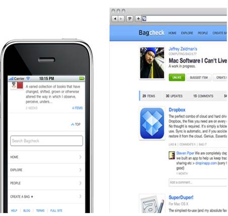
Separate mobile sites have their own URL (m. or mobile.) and typically provide a different content and behavior than the full website version. On mobile sites, the design privileges the most requested features in detriment of other less relevant content (Robbins, 2012). As a result, the two versions of the website deliver different experiences. Figure 2 shows an example of mobile site and its full version.
Mobile sites present several advantages over their full versions, to name a few:
Performance: Mobile site are specifically designed according to the capabilities of mobile devices. In addition, optimized multimedia content is included in order to reduce load times.
Navigation: By its very nature dedicated mobile sites are task-orientated, which helps users expect to find information quicker than on desktop sites.
Features: Mobile devices provide a number of technical capabilities that may be incorporated on the design. Location detection, device orientation, and touch are already present on mobile web browsers, and others like digital compass and ambient light awareness may be in the future.
Separated mobile sites may provide richer experiences through customized interfaces, and take advantage of mobile capabilities such us geolocation. However, there are drawbacks associated to mobile sites, among them:
Search optimization. Having separate URLs (desktop and mobile) complicates sharing links between users of the two versions of the site.
Redirection. Users need to be redirected from the desktop site to the mobile site, and vice versa. This adds to load time and impacts on search optimization.
Content forking. Having separate sets of content double the tasks of content management.
Comparative analysis
Three major strategies for mobile web design have been described: responsive web design, adaptive web design, and separate mobile sites. All approaches present advantages and disadvantages for web designers and end users. To understand which strategy better suit mobile web design is necessary to compare all approaches between each other.
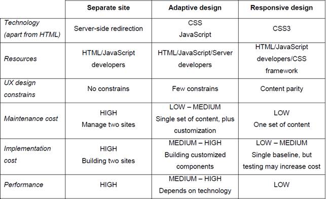
Table 1, presents a summary of the technical aspects of each approach, and compares them in terms of technology requirements, constrains to user experience design, maintenance cost, implementation cost and, performance.
First, regarding the enabling technology, separate site requires server-side redirection to lead users to the optimized-separate version of the site (mobile or desktop) properly. This does not occur with the other two approaches where there is a single site. However, the difference between adaptive and responsive sites is that the former relies on JavaScript to detect the characteristics of the device and then select one of several variations of the site accordingly; whereas the latter employs CCS media queries to create layouts that scales to the size of the screen, the same media is delivered to all devices and adjusted at time of display. Correspondingly, with regards of resources needed, apart from HTML all strategies require specific technical skills such us server-side development and CSS frameworks (e.g. Bootstrap).
Second, the selected approach may constrain in different levels the design choices for the user experience. While responsive sites are constrained to content parity across all devices, adaptive sites may serve different content to different devices. On the other hand, separate sites are not constrained at all. Moreover, they can take advantage of unique features available in smart phones such as geolocation, and the accelerometer to design experiences specifically tailored for mobile consumers.
Third, in terms of costs, maintenance is higher for the separate-site approach because the whole point of this approach is to maintain two sites instead of one as in adaptive and responsive sites. Nevertheless, although responsive and adaptive seem to require a similar effort to maintain, because adaptive sites need to keep a pool of variations of the site, maintaining them is costlier than maintaining responsive sites. Similarly, there are differences in the incurred costs of implementation. Adaptive designs require constructing customized components, whereas responsive design keep a single baseline. Consequently, the implementation cost of adaptive site is higher than building a responsive site, yet lower that building two separate sites.
Finally, with regards of performance, the approach with the lowest performance is responsive design. This is because in this approach the same media is served to all devices without considering their capabilities, which seriously tampers the performance of limited devices. Conversely, the separate-site approach has the highest performance where the design is optimized for each device.
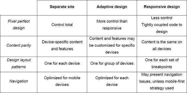
As per user experience, Table 2 shows a comparison between the three approaches with emphasis on pixel perfect design, content parity, design layout instances, and navigation.
Pixel perfect design refers to the ability to control every detail of the design down to individual pixels. With this regard, separate site provides a hundred percent of control over the design choices, whereas responsive design imposes more restrictions due its tightly coupled code. On the other hand, adaptive design is in between the former strategies.
Regarding content parity, separate site and adaptive design can deliver customized features and content to each device, in fact, they can serve unique content across devices. In contrast, responsive design keeps all content and features uniformly in all devices.
According to the number of design-layout instances, responsive design creates the largest number of different layouts because it designs all layouts for breakpoints sets in order to achieve flexibility. Similarly, adaptive design creates layouts for every major device type. However, it provides less layouts than responsive design. Conversely, separate sites have the least number of layouts (one for each site).
With regard of navigation, separate site and adaptive design optimize navigation for each device. Whereas, navigation in responsive design may be problematic if the strategy is degrading from the desktop to the mobile version. Although, navigation usability issues can be reduced by using mobile first strategy.
Comparative analysis shows that there is a trade-off between cost and user experience. A suitable strategy would be that which provides the best outcome at the lowest costs. Nevertheless, it is recommended that in addition to technical and user experience aspects, business factors such as budget, market goals, and context of application need to be considered when deciding. For instance, one possible scenario is a small company, which already has a website and needs to be mobile friendly quickly yet cost effective. From a cost perspective, responsive design would be the candidate due to its low costs of maintenance and implementation. However, it will fail in providing the rapid implementation that the business requires. In this case, the best strategy should be a separate site. Conversely, a responsive or adaptive design would be the appropriate choice in the case of a medium to large company that is renovating its website from scratch.
Conclusions
Three strategies for mobile web design have been introduced: Responsive web design, an approach that adapts page layout based on the screen size; adaptive web design, a strategy that optimizes the webpage according to the capabilities of the device; and separate site in which two sites are built, one for desktops and one for mobile.
Each strategy presents benefits and limitations in terms of cost and user experience, which, along with business considerations should be evaluated when selecting a strategy for designing a mobile web site.
As per the technical analysis (Table 1), separate site has the highest costs of implementation and maintenance yet it provides a superior performance. On the other hand, adaptive design shares the advantages of responsive design regarding ease of maintenance and implementation; and adds the ability to customize content for specific devices. However, as responsive design it could be limited in tailoring experiences to mobile websites.
Similarly, when comparing user experience (Table 2), separate site provides full control, allowing perfect pixel design, and enables to create optimized navigation and customized content. As well as separate site, adaptive design offers customization capabilities in content and navigation, yet it restricts the design choices, although not much as responsive designs.
As responsive web design and adaptive web design are relatively novel approaches. Further research might explore the applications of these strategies in other contexts, e.g. accessibility. In addition, further quantitative studies on performance are required to assess these strategies exhaustively.


