1. Introduction
In order to analyze and understand large-scale software systems several techniques have been developed and one of the most interesting is software visualization. This approach takes advantage of the human’s brain ability to recognize and understand graphic patterns and images and has been extensively used by many researchers to propose a wide variety of techniques and supporting tools. Unfortunately, not many of them have been empirically evaluated, which indicates that the systematic, disciplined, and controlled method for evaluating visualization techniques provided by experimentation has hardly been used (Wettel et al., 2011; Shahin et al., 2014; Seriai et al., 2014). As a consequence, several studies have highlighted the need for an objective evaluation of the proposed visualization techniques that allows researchers and practitioners to identify the pros and cons of applying them for performing typical software engineering activities. Among the existing empirical evaluation of software visualization tools, most controlled experiments are dedicated to the validation of the tools developed by the authors of those studies.
This study presents a controlled experiment aimed at evaluating an independent graph-based visualization technique, not developed by the authors. Graph-based visualizations are the most popular techniques used to represent software architectures (Shahin et al., 2014) and explicitly depict software organization and its key aspects (Dąbrowski et al, 2011). Our purpose is to evaluate the efficiency and effectiveness of this visualization technique at supporting typical software comprehension tasks. Source-code-based exploration technique is our chosen baseline, since it is the common way to perform software understanding (Wettel et al., 2011; Wettel et al., 2010).
2. Related Work
Although there have been several works on evaluation of visualization techniques, we restrict ourselves to briefly report on controlled experiments aimed at assessing graph-based software visualization tools and approaches used to support program comprehension.
Knodel et al. (2008) evaluated the impact of changing the configuration of graphical elements in their tool, called SAVE, for software architecture visualization and evaluation. The experiment compares the influence of two configurations utilizing Tomcat web server as object system. 29 academic subjects performed 10 architecture analysis tasks. Their findings show an improvement of 63% in effectiveness by changing the configuration of graphical elements.
Cornelissen et al. (2013) carried out an experiment to assess EXTRAVIS, their tool for visualizing execution traces. The experiment compares EXTRAVIS + Eclipse IDE against Eclipse IDE. The results show a time decrease of 22%, and an increase of 43% in correctness. They used CHECKSTYLE as object system, and a group of 23 academic subjects and one participant from industry.
Haitzer and Zdun (2013) conducted a controlled experiment to determine the usefulness of component diagrams to support understanding architectural level. They used the Freecol computer game as object, and 60 students as subjects. The results indicate that architectural component diagrams are useful to understand architectural connections that are hard to see by exploring code.
Quante (2008) performed a controlled experiment to evaluate whether their approach DOPG (Dynamic Object Process Graphs) is useful to support program understanding. The controlled experiment was carried out with 25 participants, all of them students, and three object systems, namely Jetris, GanttProject, and ArgoUML. The usefulness of the approach depends on the system features as it was only beneficial for ArgoUML, the biggest analyzed system.
Finally, Fittkau et al. (2015) conducted two controlled experiments, the primary study and its replication, in order to compare their tools, EXTRAVIS and ExploreViz, in typical comprehension tasks. They performed their assessment by using Babsi and PMD as object systems. In the experiment 30 students participated, and 50 in its replication. The findings show that subjects spent similar time for the small-sized system (Babsi), and a time reduction of 28% for the large-sized system (PMD) in favor of ExploreViz. Also, results show a significant improvement for both small and large-sized systems by using ExploreViz; 39 and 61% respectively.
There are two major differences between the related work and our study. First of all, most of the studies evaluate their own tools or approaches, while our study is completely independent. The assessment presented by Haitzer and Zdun (2013) is the only exception, but they used predefined diagrams in their controlled experiment. In our approach we provided subjects with a tool, which allows them to interact directly with the object system. The second main difference is the system object’s size. We decided to utilize a software system of 303828 LOC. The experiments cited in this section used software systems not representatives of actual industrial systems. Only in the Quante’s experiment (2008) the largest system has 319917 LOC, which we consider a reasonable and representative size.
3. Methodology
3.1 ISPACE in a Nutshell
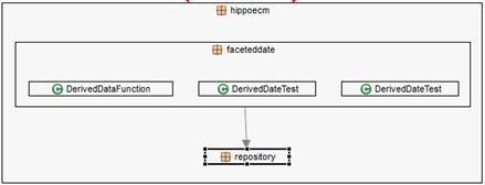
The main factor being analyzed is the usefulness of the graph-based visualization technique, which in this case is implemented in the ISPACE tool against the typical code-based exploration by using Eclipse IDE . The selection of the graph-based visualization tool was strongly influenced by the easiness of use and installation, the proven usefulness of the generated visualizations, and the ability to visualize packages which on one hand is the natural decomposition mechanism of a java system, and on the other, is essential for understanding non-trivial programs (Lungu et al., 2006). This Eclipse plug-in allows the users to explore the structure of a software system, i.e., its components and their dependencies using a nested-labeled graph. Nodes are called container boxes and can contain other nodes. Edges represent relationships between boxes, and the number of dependences is mapped onto the weight of the arrows (Aracic et al., 2006). Figure 1 shows a screenshot of the ISPACE user interface. It represents the packages hierarchy hippoecm.faceteddate and its classes, and its relationship with hippoecm.repository package. This hierarchical-recursive organization is the typical structure of object-oriented software (Caserta & Zendra, 2011).
3.2 Experimental Design
Research Design is the process of selecting a method for a particular research problem, tapping into its strengths, while mitigating its weaknesses (Easterbrook et al., 2008). The purpose of our controlled experiment is to provide a quantitative evaluation of the effectiveness and efficiency of the graph-based visualization technique when compared to a common code-based exploration technique. Throughout this section the complete experiment’s design is explained in detail.
3.2.1 Research Questions
The following research questions were formulated:
RQ1: Does the use of graph-based VT (Visualization Technique) increase the correctness, when performing software understanding tasks?
RQ2: Does the use of graph-based VT reduce the completion time, when performing software understanding tasks?
Thus, there are only two treatments in our experiment, one that provides subjects with a graph-based visualization tool for performing the tasks (that is, ISPACE), and another that provides subjects only with the Eclipse IDE. A between-subjects design was used, so that each participant was tested on only one treatment.
3.2.2 Hypotheses
Based on the formulated research questions, the null and alternative hypotheses are given in the Table 1.
Table 1 Hypotheses.
| Null Hypothesis | Alternative Hypothesis |
| H10: There are no significant differences in correctness between both techniques for software understanding tasks. | H1: There are significant differences in correctness between both techniques for software understanding tasks. |
| H20: There are no significant differences in completion time between both techniques for software understanding tasks. | H2: There are significant differences in completion time between both techniques for software understanding tasks. |
3.2.3 Object System
A real system was chosen for our assessment. This selection was made based on two criteria: 1) it has to be as large as typical industrial software, so that it is possible to extend and generalize the results, and 2) its application domain has to be familiar to the subjects, in order to prevent unnecessary confusion among participants. The selected system was Hippo CMS , a friendly and popular Content Management System written in Java and used by a variety and well-known range of clients such as: Autodesk, ACM, and the University of Amsterdam among many others. It has 145 packages, 928 classes, and 303828 lines of code.
3.2.4 Tasks
For choosing experimental tasks, three strategies were adopted. The first one was to survey practitioners for identifying activities they consider important in the software understanding process in industry; the second one was to look for typical tasks in previous and related studies, and the last one was to make sure that each task requires a reasonable amount of time to be completed, yet the set of tasks does not require more than 120 minutes.
Six tasks were finally selected in order to cover the most important and common software understanding activities (Pacione et al., 2004). We made a final decision on the set of tasks, described below, after a pilot study with two subjects to determine the approximate amount of time needed to complete the tasks, to remove ambiguities, and to improve the wording of the instructions and questions of the experiment.
Task 1. From a structural viewpoint, what is the most important package or set of packages in the system? How does it interact with the others? How did you identify it? Rationale: Assessing high-level structure/architecture of the software system and how its components interact is a key comprehension activity to understand the domain of the system (Pacione et al., 2004).
Task 2. Describe the class structure of the package P. That is, relationships among entities. How did you identify that structure? Rationale: Investigating the internal structure of an artefact is a typical comprehension task (Pacione et al., 2004).
Task 3. Which is the class in the package P with the strongest coupling to package Q? How did you identify that class? (Cornelissen et al, 2011). Rationale: Coupling and cohesion are two of the most important design concepts and help to determine how the system works and how easy it is to maintain and evolve.
Task 4. Which is the class in the package P with the highest fan-in (incoming calls)? Which is the class with the lowest fan-out (outgoing calls)? How did you identify them? (Fittkau et al., 2015). Rationale: Understanding dependencies between artefacts and assessing the quality of the system's design is one of the principal activities in software comprehension (Pacione et al., 2004).
Task 5. Look for the class C in the package P. Evaluate its change impact considering its caller classes. The assessment is done in terms of both intensity (number of potentially affected classes) and dispersion (how these classes are distributed in the packages structure). How did you do this task? Rationale: Impact analysis provides the means to estimate how a change to a restricted part would impact the rest of the system. Although extensively used in maintenance activities, impact analysis may also be performed by developers when estimating the effort needed to perform a change. It also gives an idea of the quality of the system. A part of the system which requires a large effort to change may be a good candidate for refactoring (Wettel et al., 2011).
Task 6. Describe the purpose of package P. How did you determine the purpose of that package? Rationale: Investigating the functionality of (a part of) the system and understanding its domain is one of the main and useful activities in software comprehension for practitioners and researchers (Pacione et al., 2004).
3.2.5 Subjects
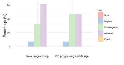
Subjects in this controlled experiment were undergraduate students from a Software Engineering course. As we see in Figure 2, all subjects had knowledge of the fundamentals of OO programing and design, and Java programing experience, which was estimated as an adequate background for performing the experiment. Since motivation is an essential element of software visualization evaluations (Sensalire et al., 2009), to recruit participants we offered a reward and 21 students from the course decided to accept the invitation. However, it was necessary to discard the responses of one of the participants, since the participant did the tasks in just a few minutes, which indicated lack of serious effort.
To assign the two treatments, participants were divided into two groups, maintaining a balance between the groups with respect to course performance as much as possible. To do that, the students were grouped in three categories namely, A, B, and C, according to their grades and the quality of their contributions to the course software project. After that, the students of each category were evenly distributed among the two treatments using the blocking technique (Table 2).
3.2.6 Data collection
All subjects answered an online questionnaire designed using the Qualtrics system. The tasks were presented in the order they appear in Section 3.2.4. Each task was timed and the subjects were asked to write the answer in the space provided in the online forms. They were not allowed to go back to questions already answered or skip a question without answered it.
3.2.7 Dependent and Independent variables
Since the current experiment has the purpose of measuring the effectiveness and the efficiency of graph-based VT at supporting software understanding tasks, we consider correctness and completion time as our dependent variables. The correctness of each answer was scored by one of the authors with a number between 0 and 10 (See grading scale in the experimental package). All answers were previously mixed, so the grader did not know which treatment was rating. The time spent by a subject on answering a task was recorded by Qualtrics, the online survey tool used. The type of technique was considered as the independent variable. This variable has two levels, i.e., graph-based visualization and source-code-based exploration technique.
3.2.8 Controlled variables
We identified the participants’ course performance as an influential factor over the experiment’s results. To mitigate this potential influence, we used the blocking technique based on the criteria and categories described in Section 3.2.5.
3.2.9 Study procedure and instrumentation
We ran a pilot study that allowed us to verify the feasibility of the tasks, calculate the approximate time required by each task, and improve the wording and clarity of the questions and instructions for the participants. It was performed by two students, each one of them performed tasks for one treatment. Before the study, one of the authors made a brief presentation of ISPACE to the entire course. At the same meeting, the presenter did a review of the main features provided by Eclipse for exploring the structure of a system. In addition, when starting the experiment, the ISPACE group was given a one-page description of the visualization tool and a brief tutorial of the most relevant Eclipse functionalities for performing the tasks of the study; and the other group was provided only with the Eclipse tutorial. The study was conducted in a laboratory where each participant used a laptop computer previously set up with the software required. Participants in the ISPACE group were allowed to use any Eclipse feature they thought are essential for doing the task at hand, in addition to the ISPACE plug-in. At the end of the study, they filled out a short post-questionnaire. The complete set of study materials is available for reviewing and replication purposes .
3.2.10 Threats to Validity
External validity refers to the degree to which the results of our study can be generalized to other populations and contexts. First of all, the subjects were undergraduate students with acceptable knowledge of Java and Eclipse, but with no knowledge of the software architecture subject. It is likely that using graduate students or industry developers, the results may have been somehow different. Secondly, the six tasks chosen refer to a single medium sized system. Thus, the representativeness of the tasks and subject system selected is another threat that reduces our ability to extrapolate our results to other Java systems and other types of comprehension tasks.
Internal validity refers to unrelated factors that may compete with the independent variable in explaining the study results. First of all, to reduce the threat that the subjects may not be competent enough to perform the tasks proposed, we chose them from a software engineering course, ensuring that participants had basic knowledge of the Java programming and the OO paradigm. In addition, all subjects attended a brief presentation about the main functionality of ISPACE and the Eclipse IDE, and also received short tutorial of both tools. Secondly, based on the performance of the students in the course, we grouped the subjects such that both groups would have participants with fairly similar programming skills and software engineering knowledge. In this way we mitigated the threat of an unbalanced distribution of the subjects’ expertise across the two experimental groups. Third, since we are conducting an independent assessment, the choice of the tasks was not biased toward any technique, and participants in the ISPACE group were allowed to use any Eclipse feature they thought are essential for doing the task at hand, in addition to the ISPACE plug-in. Finally, the participants were recruited on a voluntary basis, all of them received a reward simply for participation, they were assured of the anonymity of their answers, they did not know neither the study goal, nor which group they were before performing the study.
4. Results and Discussion
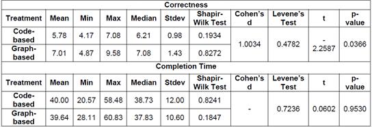
We used the two-tailed Student’s t-test for our analysis as it is the most suitable for our experimental design. This test requires that our data meet the normal distribution and depends on equal or unequal variances. To test the normal distribution, Shapiro-Wilk test was used and to test homogeneity of the variances, Levene’s test was conducted. Both test succeeded assuming a significant level of 0.05 (α=0.05). The complete statistics related to the experiment’s result are presented in Table 3.
We performed the analysis for correctness and completion time using RStudio Statistical Software. All scripts and results are available as part of the experimental package.
4.1 Overall Analysis on Correctness
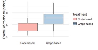
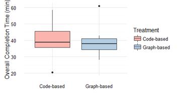
Student’s t-test revealed a p-value 0.0366. In consequence, we reject H10 in favor of the alternative hypothesis H1 indicating that the mean correctness in the graph-based treatment was significantly higher than the one for code-based exploration treatment. This means that the data show evidence that the graph-based visualization increases the correctness in program comprehension tasks (21.45%). To understand better de magnitude of the difference between the two treatments [42, 43], we decided to compute the effect size using Cohen’s d measure. The found value was 1.0034, which means a large effect due to the support of the graph-based visualization technique. The effect of the technique on correctness is illustrated in Figure 3.
4.2 Overall Analysis on Completion Time
For the completion time analysis, we decided to remove results from both tasks T1 and T4 due to their low correctness, especially in the code-based treatment, which makes impossible the comparison. Even more, we decided to perform an extra grading including only results from the remaining tasks (T2, T3, T5, and T6), and removed all subjects with a total score less than 7.5, in the same way as the evaluation performed by Fittkau et al. (Fittkau et al., 2015). It ended up eliminating 3 subjects per treatment.
Student’s t-test revealed a p-value 0.9530. Thus, there is no evidence to rejected H20 in favor of the alternative hypothesis H2, indicating that the difference between the mean completion time in both graph-based and code-based treatments was not significant. This means that the data show no evidence that there are significant differences in completion time between both techniques for software understanding tasks. The effect of the technique on completion time is illustrated in Figure 4.
4.3 Tasks Analysis
In this section we provide a deeper analysis of the results for each task. Both tasks, T1 and T4, were excluded from completion time analysis, in the same way as results below 7.5 for remaining tasks (T2, T3, T5, and T6). All results were taken into account for the correctness analysis.
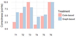
Task 1. The graph-based group performed better than the code-based group in terms of correctness (6.15 vs. 2.50). Subjects in code-based exploration treatment had a very poor performance, while for the graph-based one it was acceptable. Subjects who had an acceptable performance used strategies such as look for hierarchical relations and amount of classes per package. That was the approach used by most of the participants in graph-based treatment, which suggests that the VT leads participants through a better strategy.
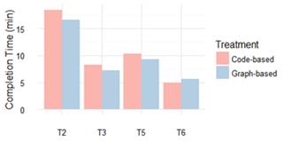
Task 2. The graph-based group performed better than code-based in terms of correctness (8.19 vs. 5.90). Descriptions of entities and relationships were more detailed in the graph-based treatment than in the code-based one, which suggests that VT gives an extra degree of accurateness. There is a small difference in terms of completion time in favor of the graph-based treatment (16.63 vs. 18.43).
Task 3. The code-based group performed better than graph-based group in terms of correctness (10.00 vs. 8.00). Code-based exploration seems to be the best strategy for this task; even participants in graph-based treatment used it to carry out this task. There is a slight difference in favor of graph-based technique in completion time (7.27 vs. 8.25).
Task 4. The graph-based group performed better than code-based group in terms of correctness (4.50 vs. 1.50). Exploring calls via metrics (number of dependencies) and caller classes was the strategy used by participants with perfect score in the graph-based treatment. In the code-based treatment no one has a perfect score, and seven out of the eleven subjects scored 0 in this task. This suggests that the use of graph-based conventions substantially improves correctness in this type of task.
Task 5. For this task the graph-based performed slightly better than code-based in terms of correctness (5.25 vs. 4.75). However, both groups had a low performance. Evidence suggests similar results and similar strategies (searching for relationships). On the other hand, the graph-based performed better than code-based in terms of completion time (9.25 vs. 10.34).
Task 6. No significant differences between both techniques in correctness were found (10.00 vs. 10.00). Evidence suggests that VT leads subjects to use mostly a name recognition strategy, while in code-based treatment most subjects inspected code to understand package’s functionality, and just one subject used the name recognition strategy. The code-based group performed slightly better than graph-based in terms of completion time (4.91 vs. 5.66).
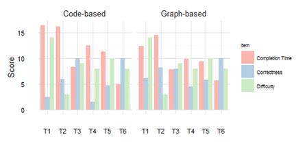
In summary, subjects in the graph-based group performed better in tasks T1, T2, T4, and T5 in terms of correctness, with the largest differences in tasks T1 and T4. For task T6, final results in correctness were exactly the same for both techniques. Task T3 was the only one in which the code-based group overcame the graph-based one. Figure 5 shows graphical results of correctness. Subjects in graph-based treatment performed better in tasks T2, T3, and T5 in terms of completion time. The only one task in which code-based technique overcame graph-based technique was T6; however, the difference was not too large. Figure 6 shows graphical results of completion time.
4.4 Discussion and comparison of unsuccessful tasks
Both techniques performed low in tasks T4 and T5. Task 4 was used in a study by Cornelissen et al. (2011) and task 5 in a study by Wettel et al. (2011). Results in the mentioned studies outperformed considerably ours for both tasks. The experiment done by Cornelissen et al. (2011) evaluates the EXTRAVIS tool, which visualizes dynamic and static analysis against Eclipse. EXTRAVIS provides a two linked views; the massive sequence view to support trace analysis, and the circular bundle view, which is representative of the graph-based technique (Shahin et al., 2014) to perform static analysis. The subjects using EXTRAVIS performed considerably well in this task, in terms of correctness and completion time. Task 5 was taken from a controlled experiment conducted by Wettel et al. (2011). They evaluate the CodeCity tool, which presents a metaphor-based technique (Shahin et al., 2014). The study was performed over two different software systems against a base-line (Eclipse + Excel), having good results too.
Hence, the low performance in our experiment could be caused by several reasons such as: subjects’ background, unsuitability of the graph-based technique for carrying out this particular type of tasks, misunderstanding of the tasks, etc. We asked participants about tasks understandability, and only two reported misunderstanding of task T4. In order to analyze the others mentioned potential reasons, further research is necessary.
4.5 Usefulness Perception
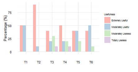
We asked subjects about how useful was the support provided by the visualization technique to solve each task. The graph-based visualization technique was rated as Extremely Useful and Moderately Useful for most participants in all tasks, especially in tasks T1 (100%), T2 (100%), and T6 (90%). For Task T3 (60%), T4 (70%), and T5 (80%) the visualization technique was less useful. Subjects perceived the visualization technique more useless for Task 3, where 30% of the subjects perceived it as moderately useless, and 10% as totally useless. This is consistent with their strategy to resolve this specific task, since 5 subjects used code exploration when solved it. The most useful support was perceived in Task 2, where 90% of the subjects rated the visualization technique as extremely useful, and the remaining 10% as moderately useful. The strategy here was to explore visual conventions. Figure 7 shows the overall subjects’ perceptions of the graph-based visualization group.
4.6 Post-Experiment Survey Analysis
After the experimental session we surveyed subjects about the tasks difficulty; 19 participants answered the questionnaire. They were asked to select the 3 most difficult tasks. The results show that task T1 was considered the most difficult task by participants, which corresponds with their low scores. Task T2 was considered the less difficult which is consistent with the results. Tasks T3, T4, T5 and T6 had an average and similar perception, but different results in correctness and completion time. Tasks T3 and T6 had excellent results, whereas participants’ performance was low for tasks T4 and T5. It could be due to participants’ confidence in their answers. Unfortunately, we have no evidence to support our hypothesis as we did not ask participants about their level of confidence. Figure 8 compares the difficulty perceptions against both completion time and correctness results.
5. Conclusions and Future Work
We conducted a controlled experiment in order to assess the impact of using the graph-based visualization technique, when performing typical software understanding tasks. Six of these typical tasks were performed by 20 undergraduate students enrolled in a software engineering course. Half of them used the ISPACE Eclipse plug-in, a graph-based tool for visualizing and analyzing Java dependency graphs; and the other half used only the code exploration features offered by the Eclipse IDE. The subject system was Hippo CMS, a friendly and popular Content Management System written in Java. To assess the influence of the visualization technique, we measured the completion time and the accuracy of each one of the participants’ responses.
The study results indicate that the use of the graph-based visualization increases the overall correctness (21.45%) and show no statistical evidence of reduction for overall completion time in program comprehension tasks. Therefore, results show benefits of the graph-based visualization technique on improving the effectiveness to carry out typical software comprehension tasks, and suggest no effect on improving the efficiency.
The post-experiment survey shows that identifying the most important package(s) in the system was seen as the most difficult task by the 74% of the surveyed subjects. This fact is consistent with the low scores, especially for the code-based treatment. This post-experiment result plus the results on usefulness perception, where all participants rated the visualization as useful, shows the poorness usability of the code-based exploration technique for supporting high-level understanding. 53% of the subjects found describing the class structure of a package as the easiest kind of task. The excellent results of the graph-based group in that task (T2), and the favorable perception point out the usefulness of the visualization for understanding internal structure of artifacts.
We plan on replicating this study with industrial subjects and organizing subsequent similar studies to assess the influence of other visualization techniques on typical software comprehension tasks. Another direction is to characterize the types of tasks in which each of the four visualization techniques (Shahin et al., 2014) is more appropriate and effective, and similarly, identify those in which the visualization support does not improve neither the efficiency nor the effectiveness.
Since replications play important roles in the construction of knowledge (de Magalhães et al., 2015), and most of the software engineering experiments have not been replicated (Da Silva et al., 2014), we provide a complete experimental package including raw data, R scripts, and other detailed material in order to encourage other researchers to replicate our experiment or take our findings as starting point to carry out other valuable empirical assessments.


